

Osteria ‘Betulla’ is the second project of a talented chef, Arslan Berdiev, the founder of the sensational restaurant ‘Birch’.
Both ‘Birch’ and ‘Betulla’ may be translated into Russian as ‘a birch’. But whereas ‘Birch’ specialises in pan-European culinary traditions, the speciality of ‘Betulla’ is Italian cuisine.
The concept of osteria ‘Betulla’ is simple Italian food with an exclusive presentation and an emphasis on the high quality of products.
An important feature of all Arslan's projects, that is also reflected in the cuisine of the osteria, is perfectionism and an unexpected serving of dishes.
From the very beginning, we were orientated at the image of an Italian canteen, however, in a very minimalistic and neat manner.
We knew how sacred the restaurant team felt about their work, so we wanted to transpose that feeling into a visual image.
This is how we came to the idea of a sort of ‘food temple’ – a place resembling an uncluttered, minimalistic European chapel filled with light.
At the same time, we aspired not only to recreate a classic Italian interior, but also to bring the modern spirit of Italy to St. Petersburg, using traditional colours, shapes, and materials.
While working on this project, we employed the characteristics of the architectural dramaturgy that is typical for traditional churches. The guests of the osteria enter its space through a tapering shaded concealed entrance. The guests initially enter the first, dimly-lit small hall with subdued lighting and further move into the second hall that is filled with light. In this way, the guests are smoothly transferred from shadow to light.
We widened all window openings in the hall (which is located in the basement, below the ground level) and lowered them to the seating level, for the hall to be better exposed to light and not be perceived as an underground vault.
Everywhere we placed the elements that are referring to Catholic aesthetics. The centrepiece of the first hall is a metaphorical altar – a large table where a pasta-chef works. All the tables are turned towards him; this creates an effect of a theatrical performance and allows the guests to observe the pasta-making mystery.
The zest of the second hall is the church pews in the centre.
At the same time, the emphasis is made on the olive tree and three kiots (icon cases). Since the Italian cuisine has its own Holy Trinity: wine, olive oil, and thyme, we placed all of them in the niches.
The drinking fountains, common in Italian cities, took the form of a wine cooler in the first hall and sinks in the restrooms.
Since Italy is famous for its wines, we couldn't do without a wine cellar which was effectually positioned in the space underneath a staircase.
Owing to the mirrors on the walls and the playing with the colours of the light , we were able to visually level the geometry of the cellar.
In addition to introducing the Italian spirit, one of the main objectives was to transform the existing dark space of the basement into a well-lit airy space that would not oppress a visitor. The task seemed very difficult, even impossible at some point. The vaulted ceiling became the main architectural technique of working with the interior space.
Not only does it refer to the church architecture, but also removes the boundary between the ceiling and the walls, while maintaining the height of the hall to the greatest extent possible. At the same time, the domed ceiling conceals a large number of engineering networks. With the divergence of
window jambs, we were able to let as much light into the hall as possible, making the space airier. This technique is also traditionally used in churches.
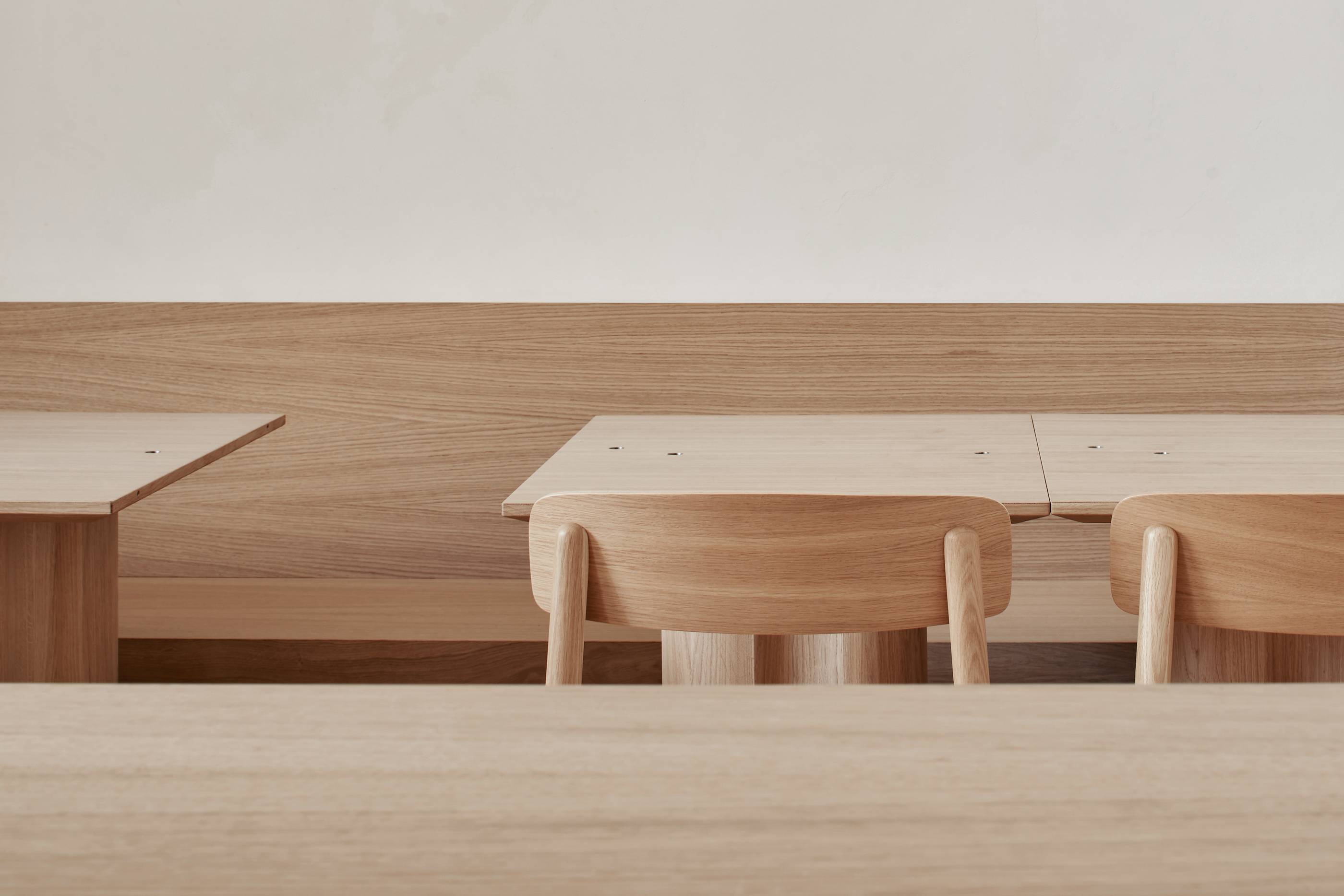
We wished to create a very neat and minimalistic look, using means of expressiveness to the least extent. This is why we used only three basic materials: travertine, which is often found in the paving of Italian streets; wood for the furniture and wall panels; and light-coloured plaster as the main material for the walls. All of these helped us to convey the image of Italy.
The development of the entrance area was a separate project. We succeeded in coming up with an interesting shape and texture. It is a kind of a crawlway made of a single piece of rock, which refers to the first grottoes of hermit monks and rupestrian churches. A notable element, much loved by all guests, is a curved mirror deeply recessed into the retaining wall. This is our silent host that welcomes guests and sees them off.
Owing to the meticulous approach to design, great attention to detail, and well-thought-out sections of the space, we were able to realise the original idea and create a minimalistic Italian ‘food temple’ where you can always witness the mystery of pasta-making and take its warmth back home.


