

Workki is a new chain of co-working spaces, with its second project implemented in Moscow City, on the 18th floor of the Federation Tower.
The core concept of the project is the creation of a comfortable environment for small companies and start-ups operating in big cities. Workki's special feature is that it has not only mini offices which are to be rented, but also a fully developed infrastructure: all residents of the co-working can use meeting rooms, lounge areas and game rooms, receive personal mail via community managers and hold working meetings in the open meeting areas.
The planning solution was largely determined by the shape of the tower. We had to place a set of rather small office spaces in the building where the floor plan had a shape of a triangle with rounded sides. Some of the rooms were also triangular, with angles in the most inappropriate places where they could not be concealed or used as a part of the design.
As a result, we came up with the idea of the use of rounded forms in the planning of the central part. This became the basis for the spatial solution of the premises.
We used the rounded volumes to place the meeting rooms, which were grouped in separate blocks. Due to the smooth outlines of the rooms it was possible to minimize corridors, which became a part of the single space flowing from one area to another.
Therefore, the perimeter part of the buildings is designed in a simple and concise style and houses offices separated by glass partitions, whereas the central part of the space features the more interesting and appealing areas.
As in the first co-working at the Neo Geo, an amphitheatre space was designed here, which can be used as a lecture hall or a cinema.
Workki is first and foremost a project for young people who are starting their business, work a lot and are ready for impressive and fascinating ideas. This is why we wanted to create an open and comfortable atmosphere which made visitors feel like staying here for a long time. Each part of the office is designed to have recreational areas and areas for group work. All parts also have mini-meeting rooms for Skype calls, where you can talk without being heard by the other people in the office; the design of all the areas makes then functional and convenient for residents.
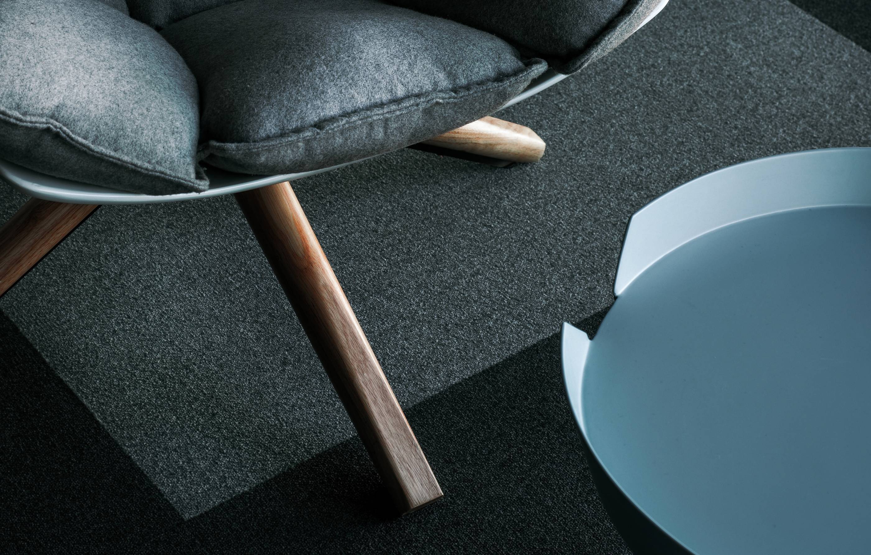
The materials used for the decoration were not expensive, but the interior still has the appropriate look. The color palette was based on the blue color and its hues, from bluegreen to indigo. The background is the black and grey walls, which are plastered to look like concrete or painted. A contrast is created by tiny inclusions of pink.
The interior features a lot of natural wood and plants. The flower pots in the form of elongated cylinders serve as full-scale decorations for the walls.


